There is a lot to consider when it comes to retail design and construction that goes beyond a Pinterest board. Your store will be an extension of your brand, and it is pivotal to pay attention to things like location, layout, materials, and fixtures.
We sat down with Josh Bloomfield, Owner & Chief Pedaller at Cycle City, to discuss how his brand has grown over the years and how that influenced the retail design and construction of his new store in the heart of Vancouver’s downtown district.

Brand History
Pacific: Can you tell us a little bit about how you have grown Cycle City to where it is today?
Josh Bloomfield: I started Cycle City back in 2010 and only offered tours. I ran the business out of my living room and would meet the guests at a local rental shop. Eventually I began needing a ton of bikes per day to run the tours so it made sense for me to open my own shop.
My first location was a tiny 500 square foot space on Burrard Street between Drake and Pacific. Within a few weeks of opening we couldn’t meet the demand for bike rentals as most of our bikes would be reserved for guided tours. We needed more bikes and more space.
We did a lot of research when looking for our next space. One thing we noticed is that most bike shops are in close proximity to Stanley Park. Our Burrard Street shop, however, was getting great traffic simply because we were closer to where guests were staying in the downtown core. When we came across our first location on Hornby Street, not only was it on a bike route but we did some research and found that there were about 2500 hotel rooms within a 2 block radius.
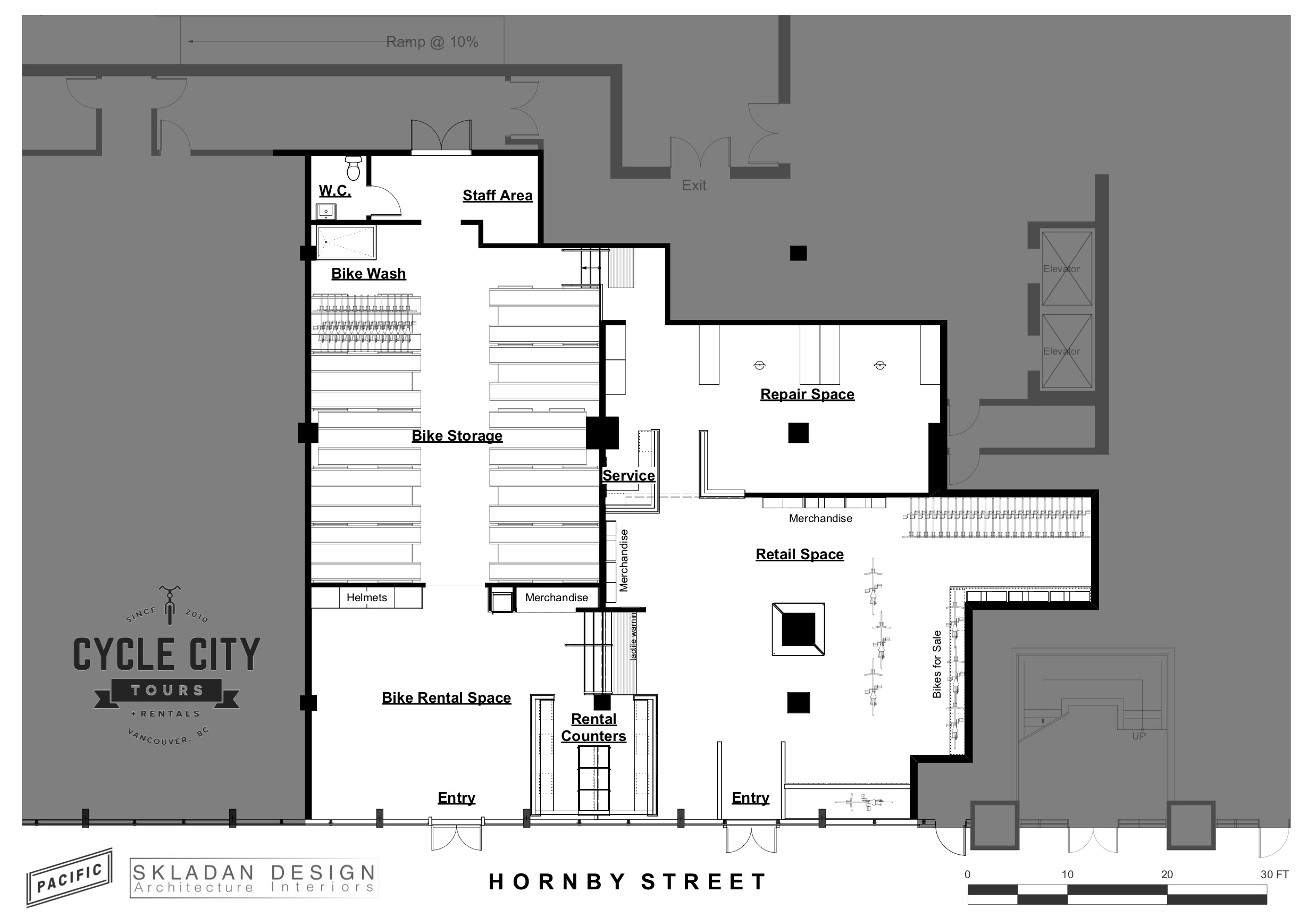
So we opened the Hornby Street location but it didn’t take long for us to outgrow the space. We needed more space to manage the high traffic flows and all too often had people spewing into the street. We also have a very high level of service that we offer, and we needed more space to make sure we could keep delivering on that to our guests.
When the space next door to us became available on Hornby Street we jumped on it. We kept the tours running from the existing Hornby Street space, and then expanded our offering to include rentals, retail, and service in the new space. For the past 30 years, there has been only one small bicycle service shop operating in central downtown Vancouver, and people kept coming to us looking for these services. We were excited to be able to make retail and service convenient for people living, working and exploring Vancouver’s central core.
Retail Design For Your Business: Spatial Considerations
Pacific: Based on what you are now offering, how did that influence the spatial design of the new store?

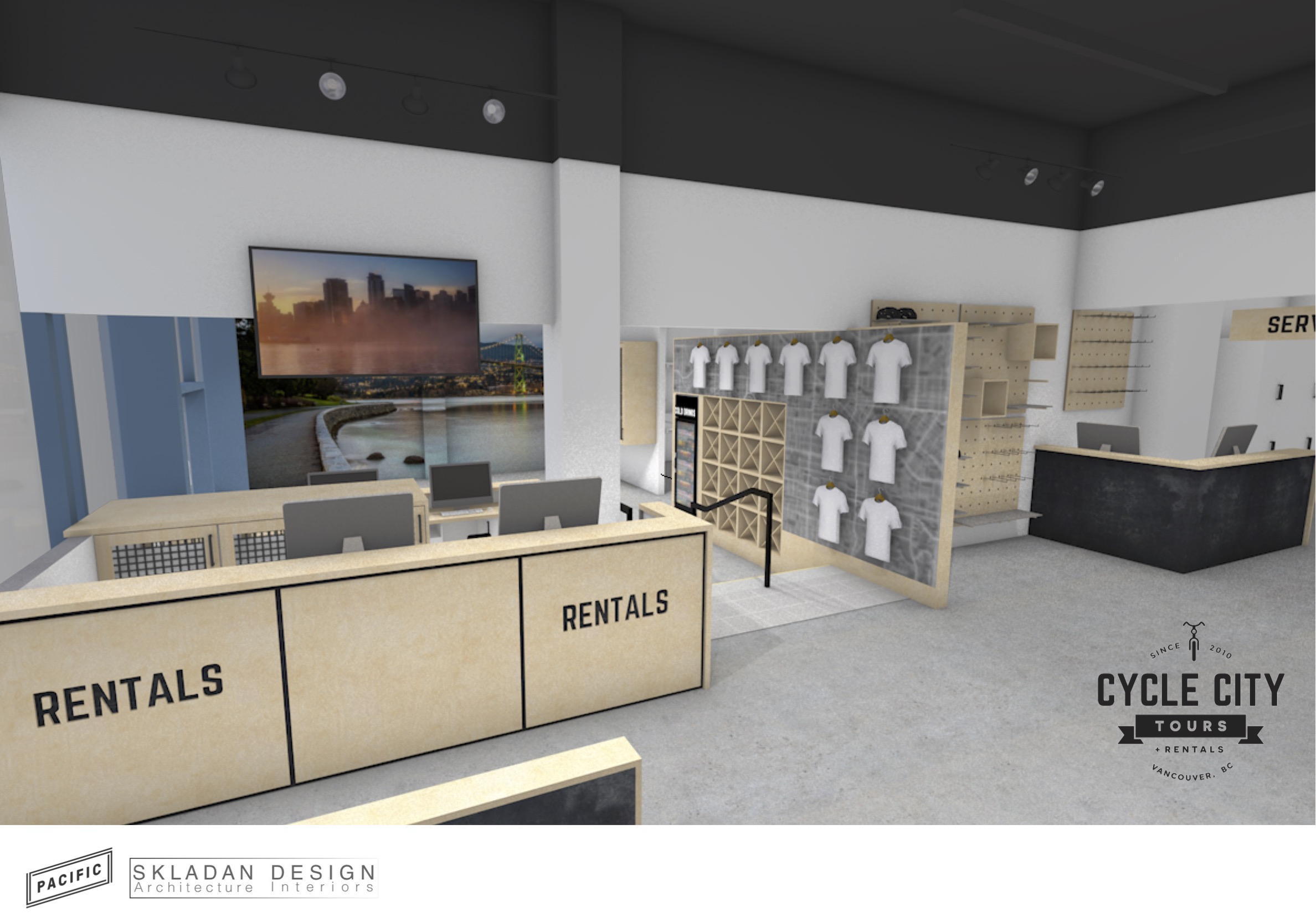
JB: Crowd management was probably the biggest challenge we were always dealing with in our stores. We can do more than 300 rentals per day so figuring that out was our first priority! We worked with Jason from Skladan Design & Architecture to design a layout that would have dedicated space for retail and service while efficiently managing the high traffic flows for the rentals. The idea is that our guests will come through one door, do all of their paperwork and choose their bikes. Then they can go down the stairs and have another staff member go through the bike overview with them, get them set up with maps, and send them on their way out of the lower door. The lower area also provides a dedicated space where people can bring their bikes back when they are done and check-out. The new flow helps keep people moving which helps with the overall guest experience.
Retail Design for Your Business: Interior Design and Material Choices
Pacific: That’s great to hear! What was your vision when it came to the interior design for the space? How did that impact material choices?
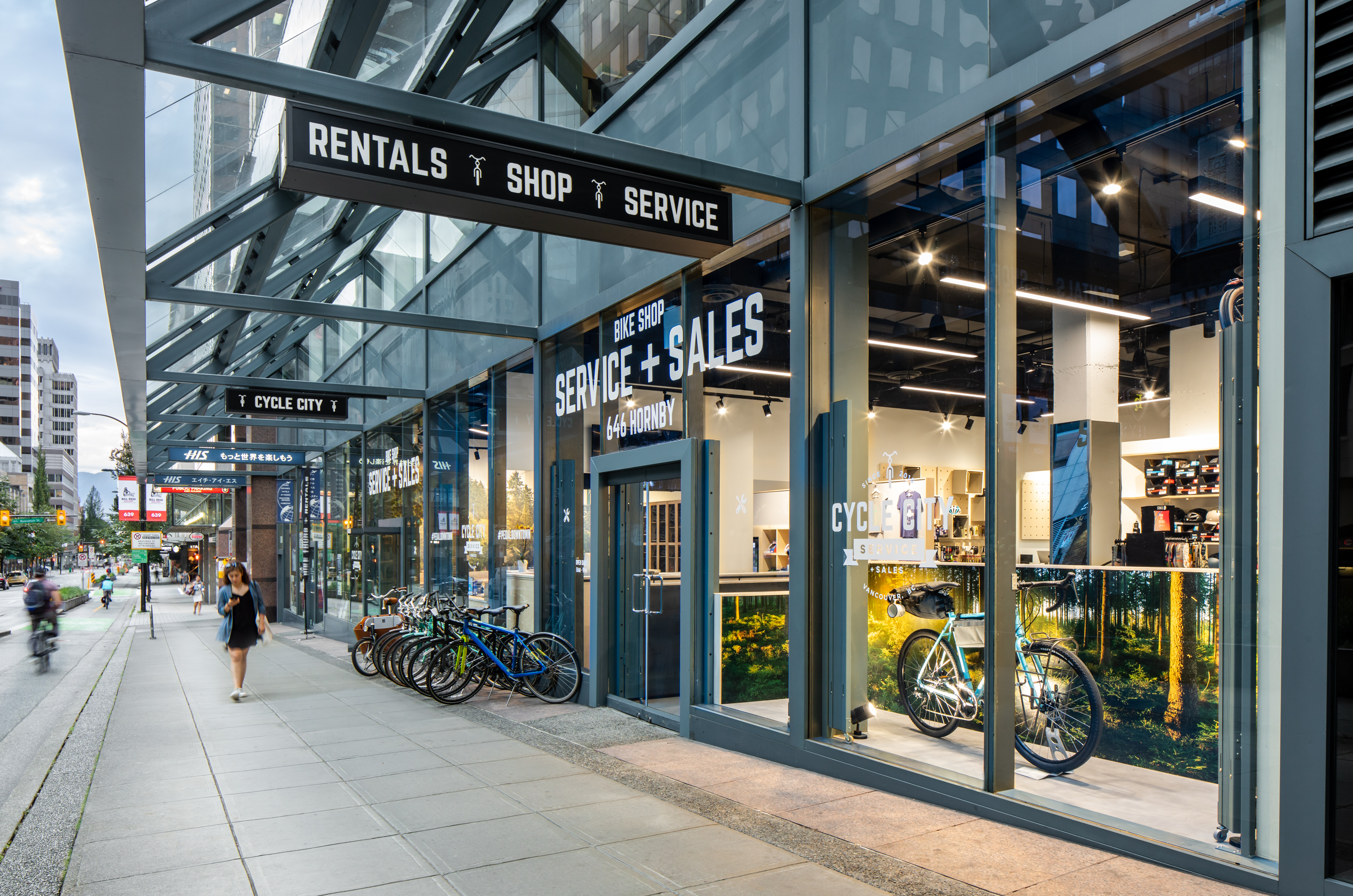
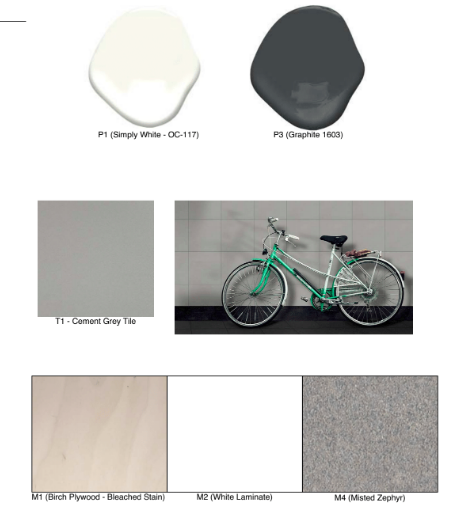
JB: My vision for the new space was that it would be warm, welcoming and inviting. I wanted the focus to be on the products and services we provide. The space therefore has more of a minimal design that mixes industrial materials with warmer, natural tones. We have white walls that act as a neutral backdrop for the items we sell. We invested heavily in lighting and built our entire storefront out of glass so the room feels open and airy. One of the most time-consuming tasks during the build-out was removing the t-bar ceiling but it was totally worth it. The high ceilings add tons of space and makes the store feel even bigger than it is.

The industrial material choices serve both design and function. We’re a bike shop, and the store needed to be built with materials to withstand heavy foot and bike traffic. We went with a raw concrete floor that can be easily cleaned, and the pony walls in the space are made with steel that will patina over time. To contrast the more industrial elements we used a lot of baltic birch and bleached wood for neutrality and lightness.
Retail Design for Your Business: Merchandising and Fixtures
Pacific: It’s definitely a beautiful space. Now let’s talk about the retail fixtures. What did you need and why?
JB: We need a ton of helmets for our rentals. And we need to keep them clean and organized. I had the cabinet designed with a mesh front so our staff could quickly find what they needed and also to help with ventilation for the equipment. The cabinet is also equipped with charging stations for our e-bikes. We have the largest fleet of e-bikes in the city and having the batteries charged and stored here ensures they are ready to go whenever someone needs them.
Our retail system at Cycle City is pretty unique. We designed and constructed a peg board and dowel system that incorporates shelving and boxes. The entire system is easily configurable to our needs. We can quickly change things up when new products come in, as the seasons change, or when we want to feature products. You’ll also notice that we floated the peg boards off of the wall which adds depth to the display.
We designed the t-shirt boxes to be self-serve, alongside a gift shop area for locally crafted goods. We also built a low bench with storage along the back wall. For now that acts as easily accessible storage for my team to grab items they may need. In the future the idea is that it will be used to try on cycling shoes as we will be bringing in more apparel to the store.

Time To Hit The Road…
Pacific: Thanks for sharing your insights into how the new Cycle City came to life, Josh! Hanging out in your store always inspires us to hit the streets and get pedalling.
Cycle City is now open at 648 Hornby Street in downtown Vancouver. Whether you’re looking for a new bike, need to service your existing one, or just want to take a spin around town, the new store has something for every cycling enthusiast.
Swing by to see how the store came to life, and be sure to stay tuned to the Pacific Solutions Contracting Work Page for more details and photos of the finished project.